- +33 877 554 332
- info@website.com
- Mon - Fri: 9:00 - 18:30
Constance came to us because she was about to celebrate the fifth year of her ministry and revive it with an event after Covid had shut things down for about two years. She wanted to rebrand and start fresh with something that was bright and enticing for her audience.

Constance expressed a desire to have more clarity in what she would be doing with this ministry, so we knew that she absolutely had to go through our brand strategy workshop. Using the information we gained in the workshop, we would then create a brand identity, a flyer for her 5 year event, and then some graphics and templates that she could use on social media.
brand strategy workshop
logo with variations
brand patterns
event flyer and variation
instagram post templates
During this particular session, we allowed Constance to really pour her heart out about what she wanted to accomplish with this ministry, and picked bits and pieces out of her statements to construct her brand core. Below you’ll see what we came up with as the statements she would move forward with.
Purpose Statement
To empower young girls to be the best version of themselves in order to ensure that from an early age, they have foundational knowledge about self awareness and identity.
Vision Statement
To equip a new generation of women who will then lead stronger family units and produce wisdom, confidence, and stature by creating environments where they can learn and be mentored in the areas of self confidence, self worth, boundaries and body positivity in order to develop their identity.
We then went on to create her positioning statement and identify her market, and persona.
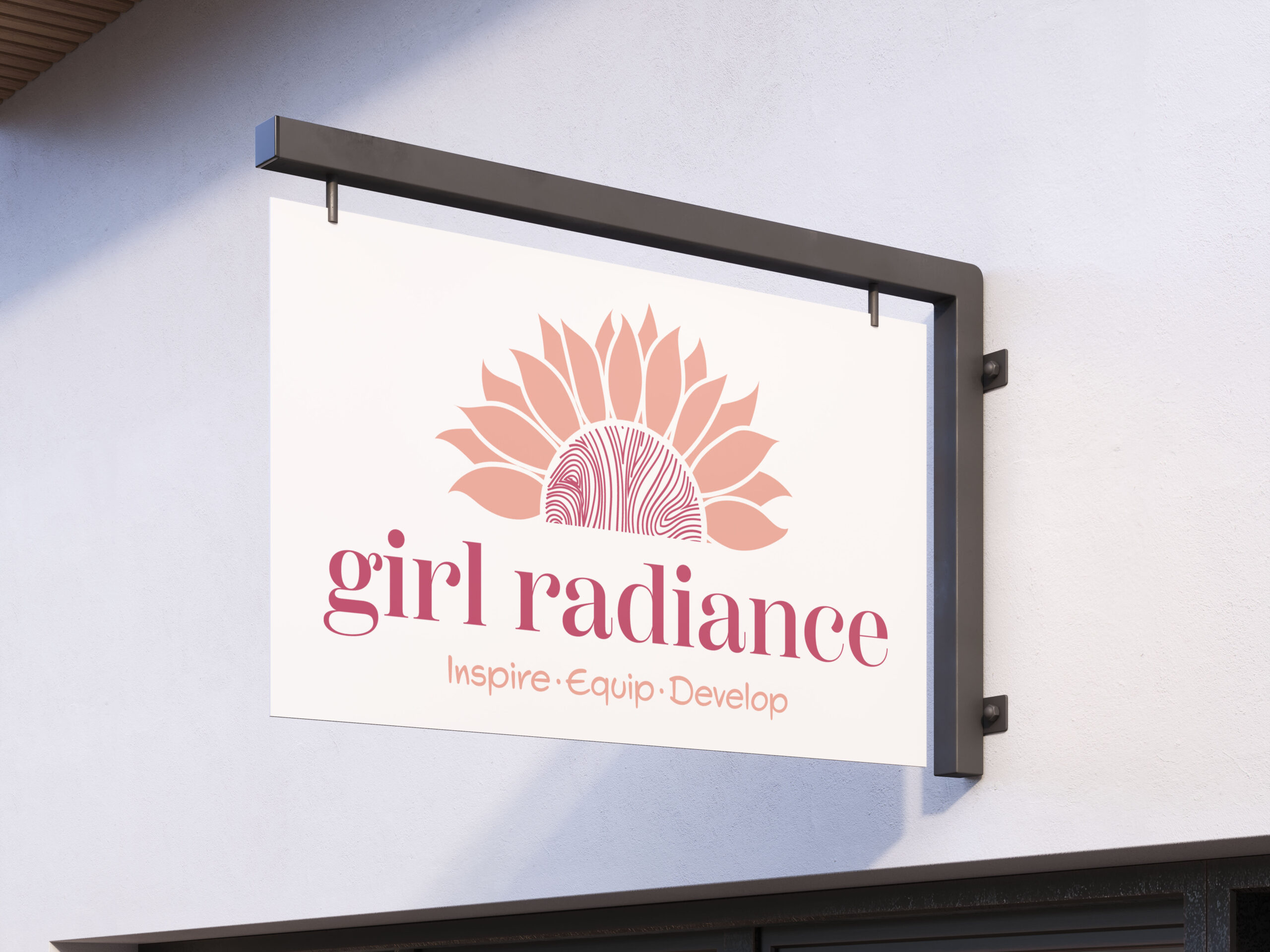
Throughout our brand strategy session, we came to understand that the focus of the brand was to help individuals discover their identity, and get the foundational knowledge they needed to impact their personal lives, which would then impact generations. This caused us to gravitate toward the sunflower because it is a symbol of growth and the plant grows quite tall. I wanted to blend the idea of a sunflower and the vibrance of the sun because after all, the name of the brand includes the word “radiance”. In the center of the sun/sunflower, we created some lines that represent a fingerprint. The key to everyone’s identity at the very basic level, is the fingerprint. No one has the same fingerprint. The fingerprint allows you to be identified in a sea of infinity, and so we wanted to highlight that in the center as opposed to the sunflower seeds that you would typically see in the center of the flower.
The lowercase text symbolizes the age group the brand speaks to and the informality and fun that is to be experienced. The girls should be able to feel comfortable, always.
Working with Gyidi Design Firm was exactly what Girl Radiance needed to begin the rebranding journey. From beginning to end GDF provided a personalized one-stop shop experience that was seamless and stress free. The brand strategy and logo design sessions were well organized, detailed and yielded results towards the overall goal. Cynthia and her team were knowledgeable, organized, patient and driven to produce lasting results. The team’s timely communication, quality of work, commitment and passion made me feel like I was their only client. Thank you, Gyidi Design Firm for helping me articulate my vision.
Design Tool: Adobe Illustrator, Adobe Photoshop, Canva Pro
We understand that making such a huge investment in your business is a BIG DEAL! We have no problem getting to know you beforehand. Use the calendar to schedule your next available date, so that we can chat!