Welcome to March!!! Every March, I get excited because I know that Independence Day is around the corner. By that, I mean GHANA’S Independence Day. My parents are both from Ghana, West Africa, and although they moved to the U.S., they raised me on such a beautiful culture and surrounded me with it as well.
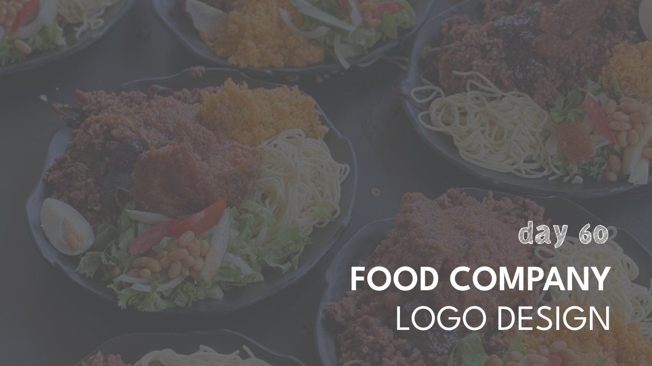
With that said, I would love to present to you a food manufacturing brand that focuses solely on making Ghanaian food preparation much easier and more accessible. I really want to highlight the great food in my country, so please bear with me because the next week will be dedicated to Ghana and “Chop Waa”.
With this design, you’ll see that I started with the crest first. I wanted a unique shape that wasn’t a circle or a shield, so I decided to with a hexagon. I really wanted to highlight the foundation of our great good, so I used a pepper — pepper is EVERYTHING! I also have cabbage leaves there to symbolize the fact that we really rely on vegetables in our cooking, and then I used a pot to signify our love for wholesome food.
When it came to the typeface, I wanted something that had a bit of character and quirkiness, but also a softness, represented by the round corners.
Stay tuned to see how we develop this brand! If you enjoy this design, please be sure to share it with a friend or two.


