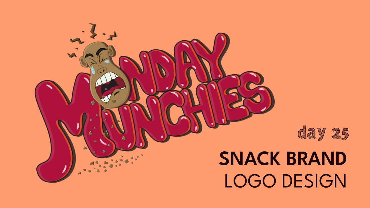
We’re continuing the week by showing you all how we developed the “Monday Munchies” brand. Today, we’re creating the logo. Yesterday, we tackled the brand character, and today, we are building on that to create the logo.
With this brand, I wanted to create a fun and bubbly type AND create a character that expressed what everyone typically feels on a Monday morning (groans and tears).
As with the character, I also drew the type because I wanted a more organic and playful bubble letter style. I went ahead with high energy colors like red and orange in order to help convey the strong sense of dread that is felt on Mondays by most.
Take a look and see what we created, and feel free to watch our YouTube video to watch us as we work!!


