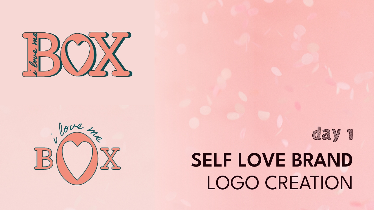
Everyone usually starts the year off with some type of weight loss goal or a goal that involves making changes to their physical body, myself included. I wanted to start off the challenge with a campaign to remind us all that we are beautiful just the way that we are. Weight loss is great if it’s done with the right intent, but if you’re attaching your weight to your beauty, let me remind you that you are more than the number that’s on the scale. This design as well as the ones over the next few days aim to remind you that you are beautiful, valuable, smart, [insert your own affirmation], and everything else!


Let’s go deeper!
I didn’t sketch this logo out in my sketch pad because I had a very clear idea of what I wanted it to look like. I wanted a typeface with rounded corners, which I created by transforming another typeface, “Rockwell”. I also knew that I wanted the “I love me” portion to be hidden within the “B” in box. A lot of the additional elements came to mind as I worked, but that is the beauty of design. New things come to you as you are working and practicing your craft. It’s amazing!
Color Palette
I knew that I wanted to appeal to women, and so I wanted a soft pink color, I also wanted to emphasize health in an elevated manner and so I thought about using green, and then realized that teal was the better way to go.

Creativity in Action! Watch it!
Enjoy this brand “I Love Me Box”, which is a self care subscription service that includes products that help you remember who you are and the power you already have.
Don’t forget to share this with a friend or two! I look forward to this 100 day journey. 99 days to go!


