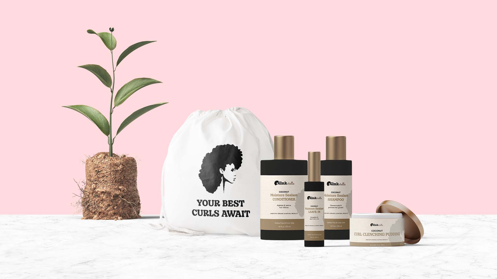
Kinkerella is a product line that revitalizes and defines your natural curl pattern. It takes your curls from chaos to a shiny bounce.
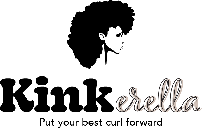
The name Kinkerella came about from merging the words“kink” and“Cinderella”. As we all may know, Cinderella is a character that was mistreated by her step mother and was given a chance to transform herself and attend the ball by her fairy godmother. It changed her entire life.
The transformation she experienced is one that Kinkerella users will experience once they utilize this product suite.
In the attached behind-the-scenes design video, you’ll watch as I create a silhouette I saw on Etsy and add my own flair to it as I digitally sketch it FROM SCRATCH. I must say, I’m really proud of this design.
design direction
Regal, Powerful, Full
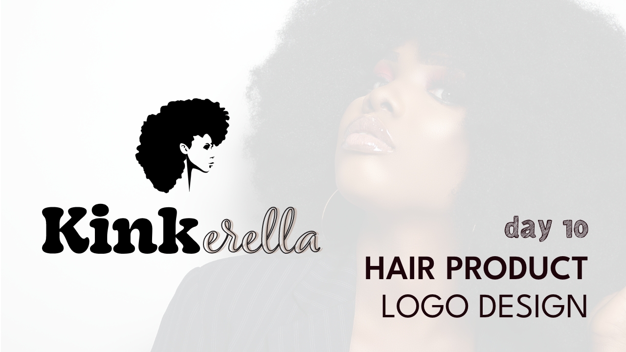
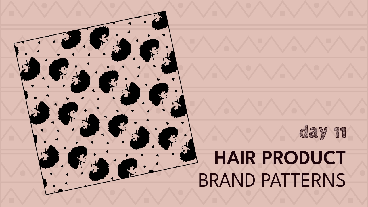
*Please note that this is a passion project, and not an actual brand…yet.
When it came to the typeface or font choice of the logo, I wanted a FULL or thick type that expressed the fullness of Afros and curls, and then a more magical font to represent that Cinderella magical wand effect. I merged both fonts and gave the cursive font a bit of a shadow.


