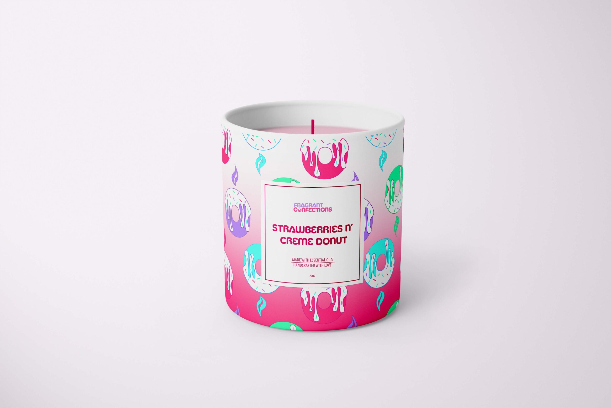
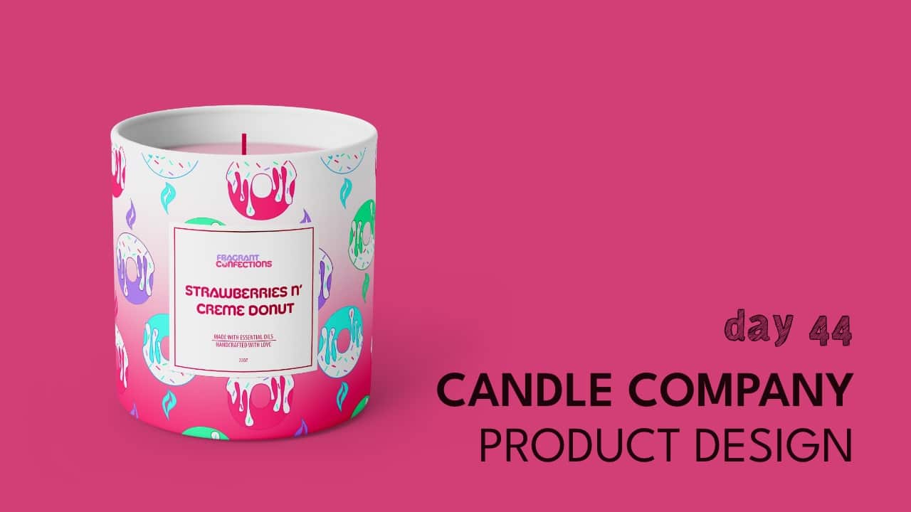
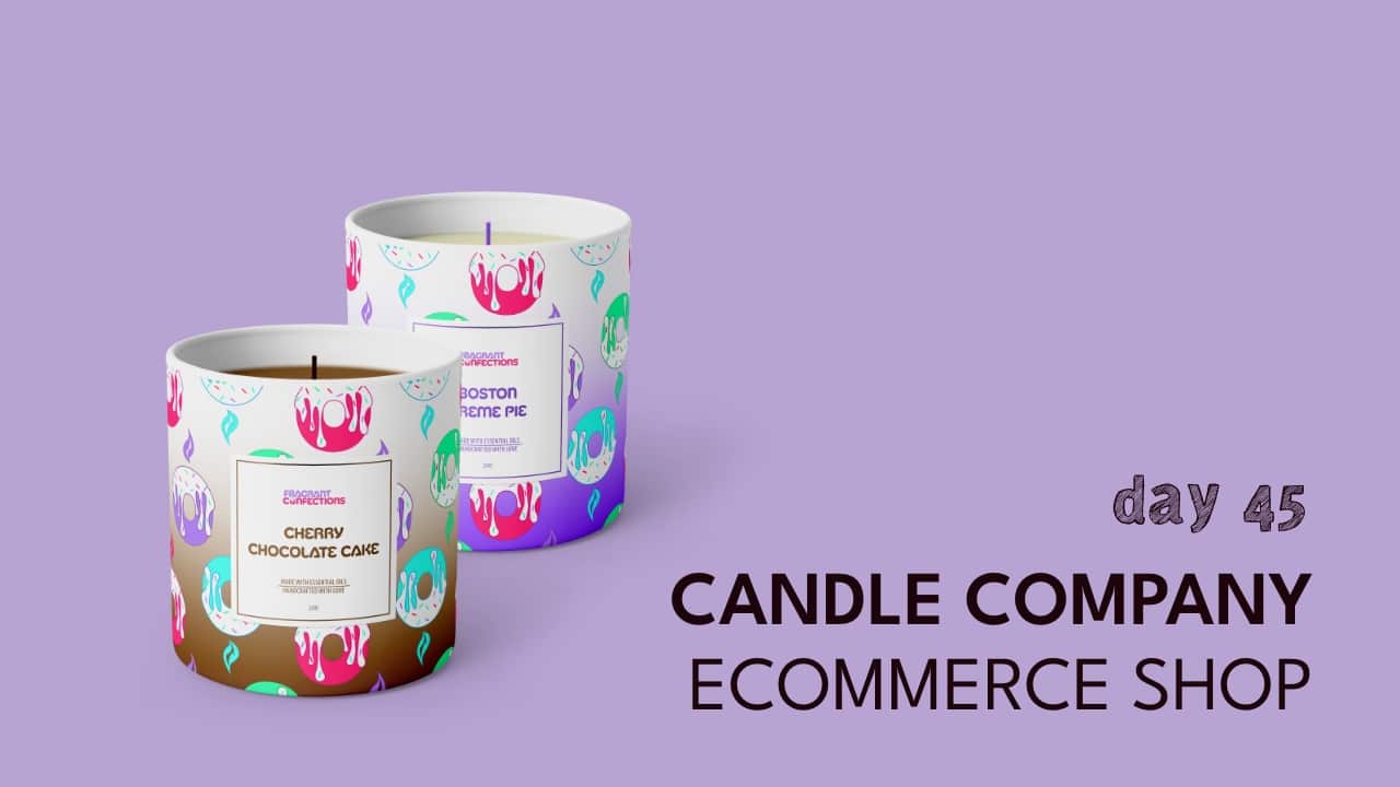
I absolutely love deserts, and I thought it would be a cool idea to have desserts that could be turned into fragrant candles. I know there’s a new trend on the rise of candles that are whipped and made to look like your favorite desserts in a jar. This brand is our take on that, with a vibrant spin.
I really enjoyed creating these designs and adding bright colors to encompass the happiness it brings to our lives when we get the chance to enjoy our favorite treats.
design direction
Playful, Colorful, Pop!
home page design
*Please note that this is a passion project, and not an actual brand…yet.
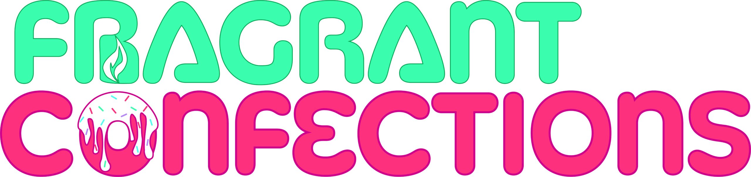
Let’s break it down. I had the idea in my mind, so I didn’t really need to sketch it out. I wanted to use the“O” in confections to create a donut that had frosting dripping down. You can also say it has a double meaning because that icing can also be seen as“wax” falling down a donut candle. The flame above the donut“O” is a reflection of the brand being about candles, thus melting the wax/icing.


