Day 89 | Drip Therapy | Secondary Logo

Logo variations are always great! I created a secondary logo to fit in more narrow spaces. I wanted to make it circular so that the typography would fit nicely around the logomark that was created a few days back. ANNOUNCEMENT!!! We are getting towards the end of this 100 day challenge, and to celebrate, we […]
Day 88 | Drip Therapy | Logotype

Today, I focused on the logotype for the brand. I found a beautiful cursive font that was thick enough to be seen even when minimized. I edited the type slightly to make the top tip of the “R” point like a needle. ANNOUNCEMENT!!! We are getting towards the end of this 100 day challenge, and to celebrate, […]
Day 87 | Drip Therapy | Logomark

Say hello to Radiance Infusions, a drip therapy brand that focuses on enhancing your wellness. Over the weekend, I watched a new reality show on Netflix, called “Young, Famous & African”, and in the series, one of the characters crowned a bachelorette party by providing drip therapy. I thought it would be fun to create a brand […]
Day 86 | Juice Brand | Web Design

This web design not only focuses on the products that are being sold, but more on the brand culture of reminding moms that they matter too, and their needs are vital. ANNOUNCEMENT!!! We are getting towards the end of this 100 day challenge, and to celebrate, we are throwing a virtual party!!!! We will be […]
Day 85 | Juice Brand | Drink Mockup

With these designs, I really wanted to create something that was unappealing because children just happen to always find anything their mom is eating as a temptation. We literally cannot enjoy anything without having to share, haha. So I wanted to make it displeasing to the children, but then I figured that I should focus […]
Day 84 | Juice Brand | Secondary Logo

In order to supplement the primary logo, this design was created to fit in a more narrow space and can even double-up as a favicon. I took the image of the “o” drink and put some text around it a circular manner and also included the tagline. ANNOUNCEMENT!!! We are getting towards the end of this 100 […]
Day 83 | Juice Brand | Logo Design

Today, I introduce you to Mommy Juice. Mommy juice is a brand dedicated to reminding moms that they need to take care of themselves first before they take care of others. Mothers often wear many hats and have the pressures of having the world on their shoulders. Their children expect them to fully deliver on […]
Day 82 | Women’s Conference | App Design

I thought that it would be really cool if participants had more control over the events or sessions they wanted to attend at this conference. So, I decided to create an app that is exclusive to the conference, which allows them to view all relevant information. They are only allowed access once they purchase a […]
Momfection

home Portfolio About The MOMfection application is for the mom who needs a sweet retreat at the end of her long day to help her wind down and relax. Who doesn’t love a well earned dessert? She can simply open up the app, enter her location or use the GPS feature, and access shops that […]
Outlet Tech Repair App

home Portfolio About Outlet Tech Repair is a service that repairs various types of technology. This app allows clients to submit/schedule tickets for their tech repair right from their mobile device. The app also allows the client to chat with a representative in order to ensure that the correct service was requested. Previous Next Prototype […]
Break Conference App
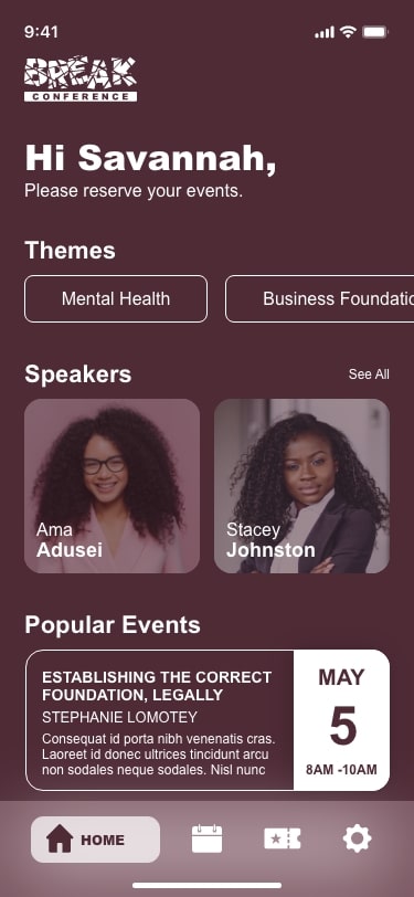
home Portfolio About This design was created for Break Conference attendees, in order to give attendees more control over the events or sessions they want to attend for the conference duration. This app allows them to view all relevant app information. They are only allowed access once they purchase a ticket for the event because […]
Babyzone

home Portfolio About Have you noticed that baby gates don’t always work? With Babyzone, users are able to map out the specific area that is deemed safe, the “safe zone”, in any room of their home using our Measure technology, in accordance with our cameras. If their child enters 1 ft of the parameter and/or […]
Day 81 | Women’s Conference | T-Shirt Design

Who loves a conference that has a specialized t-shirt design? I definitely do. I think it’s fun to have and it’s also a keepsake for those who attend these types of events. Today, I designed two variations of a t-shirt that reminds the audience of why they are at the conference in the first place. […]
Day 80 | Women’s Conference | Welcome Packet

I really love experiences, and I enjoy paper products because you can touch them, write on them, and just really delve into the materials. This conference comes with a welcome packet that has a welcome address, program events schedule, and just gives the participant all of the information they need in order to excel at […]
Day 79 | Women’s Conference | Conference Badge

Badges can serve several purposes at a conference. It’s a great way to introduce yourself, without having to do much. It’s also a great way to get access into certain places and events without having to carry a physical or digital copy of a ticket. I designed two different badge designs, one for the VIP […]
Day 78 | Women’s Conference | Web Design

I honestly had so many different ideas for this web design page, but I wanted to get away from what I would typically do(using all of my design assets), and instead wanted to be very simple and straightforward. I didn’t want the glitz and glam of the glass shards to get in the way of the […]
Day 77 | Women’s Conference | Book Cover

Now, you all get a chance to see where the idea for the conference came from. This book cover is the catalyst for the entire conference. I had a couple of ideas for the cover which involved the author’s face being completely distorted in order to show the “brokenness”, but I went a bit lighter on the […]
Day 76 | Women’s Conference | Pattern

To create this pattern, I took the shards present in the logo, and rearranged them over and over in order to create a pattern that was diverse enough to be repeated. CREATIVITY IN ACTION! WATCH IT! https://youtu.be/FXFkrC3nG14
Day 75 | Women’s Conference | Submark

Submarks are a great way to identify your brand in small spaces. To create this submark, I took a portion of the “B” in Break and fit that into a circle. I went ahead to create some negative space between the shards of “glass”. I created a multi-colored version to fit with the logo, as well as a one-color […]
Day 74 | Women’s Conference | Logo Design

We are continuing this month with designs made specifically for women, in order to honor Women’s History Month. I really thought it was important to highlight the fact that branding is not just for businesses as a whole. Branding is for campaigns, causes, experiences, and much more! This particular logo is for the “Break Conference”, which is […]