So many people dread Mondays! Personally, I don’t mind Mondays. It gives me a chance to hit the ground running, but I understand that a busy weekend makes you want to rest instead of work.
With that in mind, I wanted to create a fun food brand that celebrates all the things most folks hate about Monday.
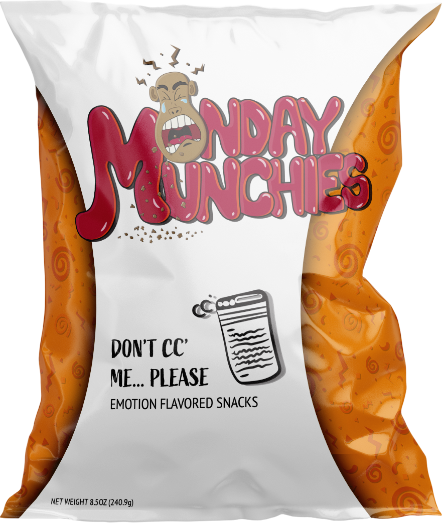
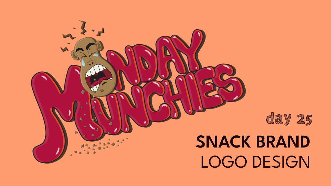
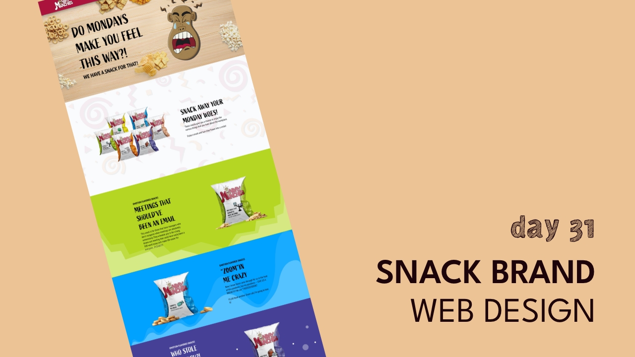
It’s called“Monday Munchies”.
design direction
Playful, Colorful, Pop!
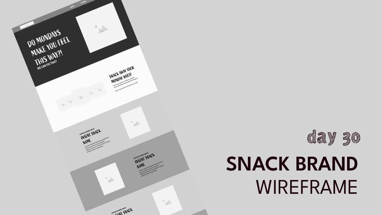
home page design
*Please note that this is a passion project, and not an actual brand…yet.
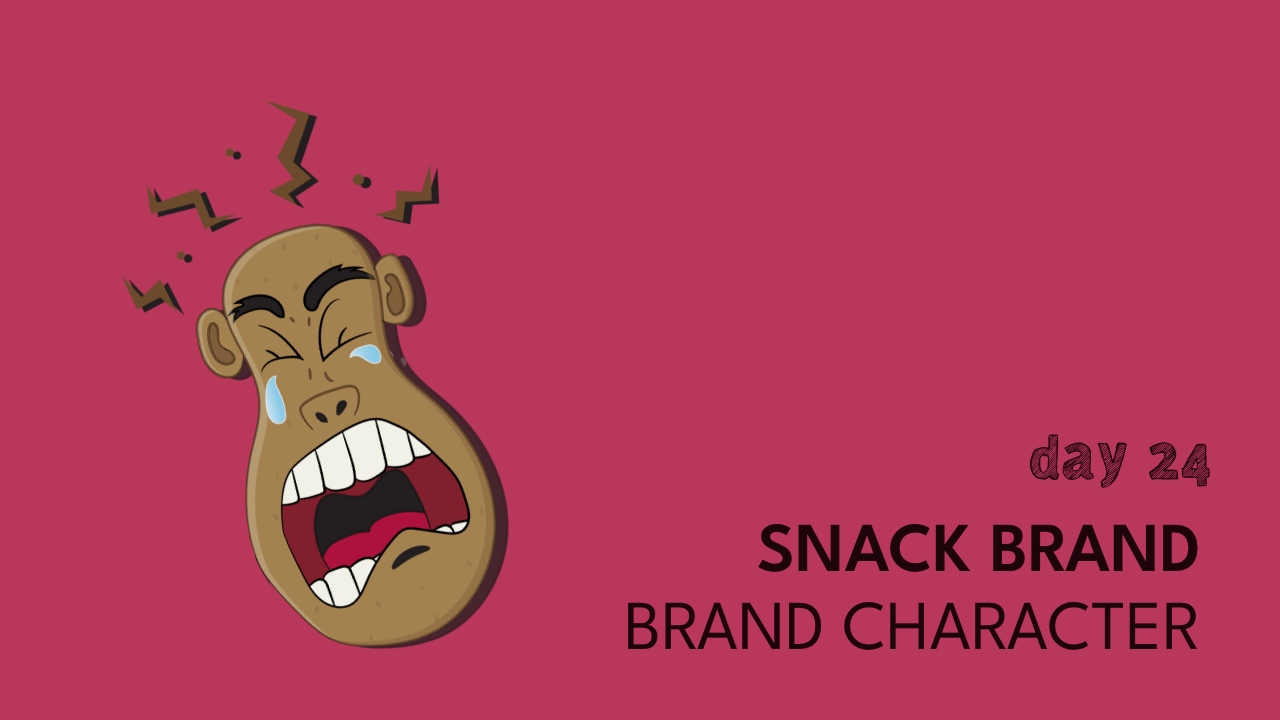
With this brand, I wanted to create a fun and bubbly type AND create a character that expressed what everyone typically feels on a Monday morning(groans and tears).
As with the character, I also drew the type because I wanted a more organic and playful bubble letter style. I went ahead with high energy colors like red and orange in order to help convey the strong sense of dread that is felt on Mondays by most. What should we name the brand character?? This character is showing how much he despises Mondays, and the tears on his face reiterate the pain he’s feeling.


